
There was a time when vintage fashion and thrifting were the sole domain of individuals that were set on defining their own personal look. That was until a few savvy hipsters introduced the retro look to the market – primarily in indie cafés and bars.
Consumers soon grew accustomed to eating their food from a repurposed barrel top while sitting on repainted office chairs from the 1960s. But this retro phenomena isn’t restricted to trendy food and drink venues. There are now marketplace giants across all industries embracing vintage to stand out from the crowd.
Here are just a few of the online companies that are embracing the trends of the past effectively with their web design.
Nudie Jeans
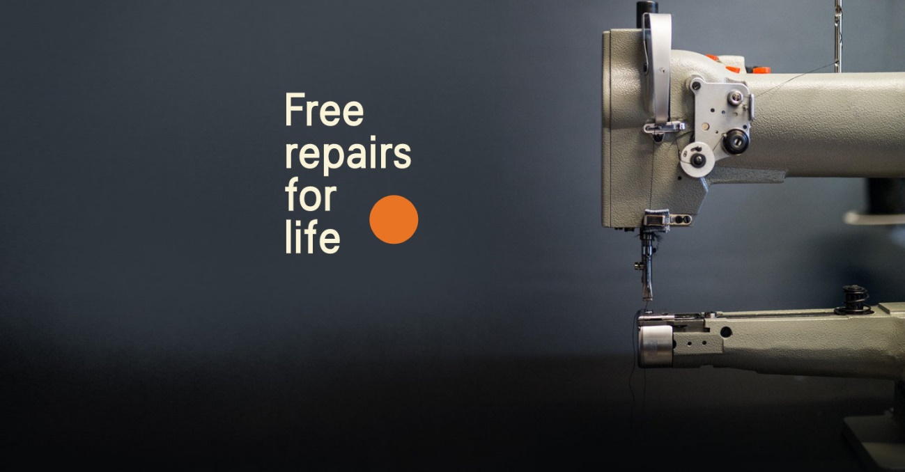
If you were to open a vintage style denim store, you’d want the building to match the tone of your products and avoid the trappings of your mainstream competitors.
That means ditching the glossy white or black sliding doors, and making sure you have no futuristic looking kiosks and no tablets or interactive displays in sight. Instead, you’d opt for the minimalistic approach.
Step into any Nudie Jeans store, or visit their website, and that’s exactly what you’ll find. The Nudie Jeans team have done their very best to make their online site the digital replica of their stores.
The colours on display are simple and a throwback to the 1960s and 70s. There are also polaroid-style photos that display their latest ranges near the bottom of the page. This helps them stand out from competitors with a more contemporary branding.
When the homepage loads, you’ll feel as though you’re glimpsing into someone else’s wardrobe rather than rooting out discounts and bargains. Nudie Jeans also make strong references to their ethical policies, which again harks back to the socially-conscious eras of the 1960s and is very salient with today’s consumers.
The Blizzard
British soccer has become flooded with money in the past two decades, improving the quality of players on the field as well as expanding their pay-packets. That injection of cash has also inspired a counter culture in the sport, who eschew the glitzy modern game.
Jonathan Wilson came up with The Blizzard as a response to modern soccer and the media organisations that covered it. The Guardian sports journalist started his career as a contributor to his local side’s Fanzine and his website is somewhat of a tribute to this bygone style of soccer journalism.
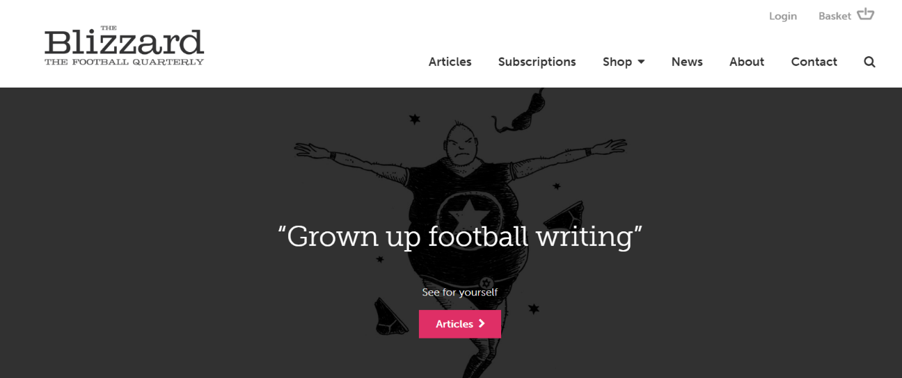
There’s no room for full-page sports adverts on The Blizzard website, instead, the website focuses on the traditional storytelling style of sports journalism.
Topics covered are often vintage or nostalgic and the visuals complement this perfectly. There are pictures, photos and animations of historical players and grounds, as well as characters inspired by soccer relics such as ‘Roy of the Rovers’.
777 Casino
The internet has revolutionised the world of gambling. No longer do the world’s gamers take to the physical slots you’d expect to find in the gambling metropolises of Las Vegas in the Nevada desert. Today, many play from the comfort of their own home – or if they’re on the move, using their mobile device.
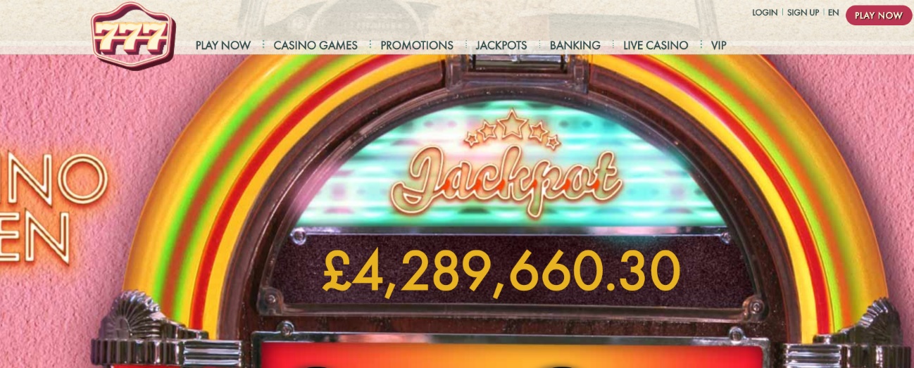
However, many still long for those days of old-Vegas, where dazzling signs and neon lighting signalled your proximity to a gambling nirvana. And 777 Casino caters perfectly for those fans of vintage gaming.
Check out 777 online casino and you’ll see how it rails against the sanitised sharp edges of modern online gambling, opting for a vintage look which gives it standout among the comparatively character-devoid online casino brands crowding the gambling marketplace.
The landing page to this site has been designed to evoke those feelings of yesteryear, when excited gamblers could sense their imminent arrival in Sin City. Every table game and slot machine has been designed to transport players back to 1970s Las Vegas. And the games themselves are among the best around – with high-end graphics and fast speeds providing real quality on top of the vintage novelty.
Oizo3000
Quentin Dupieux, AKA Mr Oizo, is one of the most revered underground artists in the world. His 1999 single ‘Flat Beat’ thrust him onto the world stage, but he’d been somewhat of hipster legend for years prior to that.
Since then, Dupieux has put his creative talents to good use, directing several well-known music videos, creating critically-acclaimed feature length films and displaying his portfolio on this website.
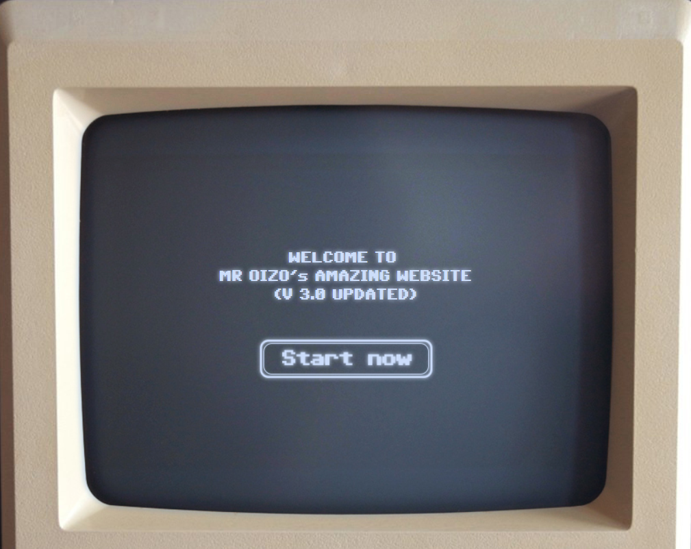
As soon as you visit, you’re greeted with a super-imposed vintage computer, complete with floppy disk drive that generates text for the user to navigate through the site. Even the cursor downgrades to a pixelated appearance you’d find on an old Windows 98 PC.
Its simplistic appearance belies its modern capabilities. Users can also stream and download music by Mr Oizo. Not many other creatives have this level of interactivity and uniqueness in their websites, helping Dupieux continue to stand out in the modern age.
Vintage Branding Co.
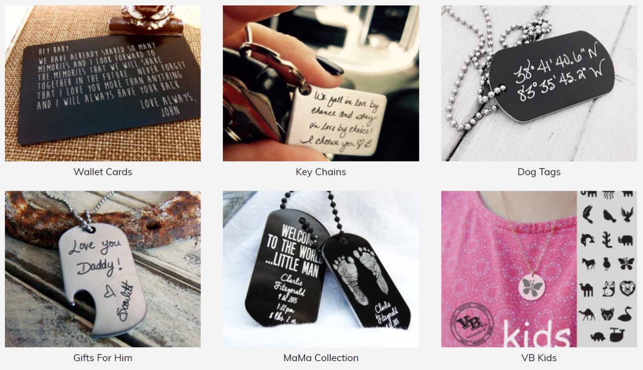
It’s one thing for companies to include retro and vintage designs in their branding and website graphics. It’s another to include it in their name. Vintage Branding Co. are a family-run business, specialising in handmade crafted fashion, selling necklaces, keychains and bracelets.
Their website design also opts for the minimalist approach, with a simple light grey background and black, handwriting-style text. This is consistent with their products, which also incorporate this style of writing.
Modern consumers are often receptive to nostalgic branding that has meaning, especially in today’s world of disposable fashion. Vintage Branding Co. have helped themselves stand out from the crowd of ultra-flashy fashion websites and stayed true to their unique selling point with their vintage-feel site design.
Retro and vintage has a mass appeal, as people search flock to businesses that have an alternative design that isn’t just on-trend. These companies have taken advantage of that and are reaping the rewards as we speak.
Summary
Vintage remains a force to be reckoned with – particularly in industries where you wouldn’t necessarily expect to find it, such as gambling. Its success is in its versatility, and as you’ll see from any of these websites, there are a number of ways to make full use of the vintage look and feel to attract customers and broaden your audience.
