
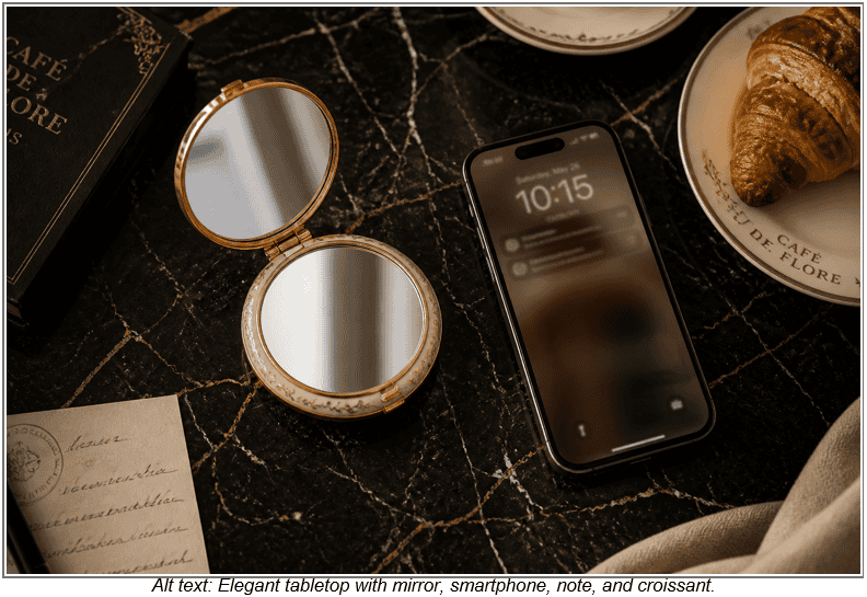
Six specific vintage decade aesthetics, ranging from 1920s Art Deco through 1990s grunge, each translate into a concrete phone case design approach with a distinct color palette, typography direction, and imagery type. Knowing the visual vocabulary of each decade marks the difference between a genuinely beautiful vintage-inspired design and something that reads as vaguely retro without meaning much.
The smartphone is the contemporary equivalent of the enamelled compact mirror and the printed silk handkerchief. It functions as a small, constantly visible personal object whose design communicates aesthetic identity as clearly as any garment choice. A person who never leaves the house in a poorly designed outfit carries a phone in hand, sets it on café tables, and holds it in every photograph, making it a permanent fixture in the frame.
Table of Contents
Your Phone Case Is an Accessory
1. 1920s Art Deco
2. 1930s to 40s Dark Romantic
3. 1950s Pinup and Advertisement
4. 1960s to 70s Psychedelic and Bohemian
5. 1980s New Wave and Alternative
6. 1990s Grunge and Alternative
Your Decade-by-Decade Design Brief
Your Phone Case Is an Accessory
With about nine-in-ten Americans owning a smartphone, most vintage fashion lovers dress with genuine decade-specific knowledge but pick a daily device cover from a generic rack. This guide closes that gap by detailing specific color palettes, typography directions, and imagery types for six distinct historical eras.
The 1920s serve as the natural starting point because Art Deco’s bold geometric forms map directly onto a vertical canvas better than almost any other historical style.
| Key Insight: The phone case is a constantly visible personal object that communicates aesthetic identity as clearly as any garment choice, yet most vintage fashion lovers pick theirs from a generic rack without applying the same eye. |
|---|
1. 1920s Art Deco
Art Deco’s visual vocabulary relies on hard geometric forms like chevrons, sunbursts, stepped pyramids, and interlocking rectangles. Stylised fan and floral motifs drew heavily on Egyptian Revival imagery following the 1922 discovery of Tutankhamun’s tomb. The signature palette combines black and gold, with accents of ivory or deep teal providing the only softness in an otherwise graphic, high-contrast system.
This rectangular format functions like a vertical Art Deco panel, mirroring the dimensions Cassandre used for his iconic poster work. A bold central motif in gold against a black background, framed with fine geometric border lines, establishes graphic authority without requiring photographic imagery.
For typography, the wide geometric serif and slab letterforms of the 1920s work particularly well as monogrammed initials centred within the composition.
If you own a genuine 1920s textile fragment or a vintage postcard from an antiques fair, scanning and uploading that material creates a truly authentic vintage-inspired custom phone case from Custom Envy.
Using historical scans directly produces a result that no contemporary approximation quite replicates. Let the geometry fill the full rectangle, since leaving significant negative space in an Art Deco composition reads as modern minimalism rather than period-accurate design.
2. 1930s to 40s Dark Romantic
The 1930s to 40s aesthetic shifts away from rigid geometry toward an atmospheric and painterly mood. The color story relies on deep, saturated darks like burgundy, forest green, oxblood, and midnight navy, which are then offset by cream or pale gold. This bias-cut silhouette era presents a graphic identity that looks luxurious, moody, and lit by candlelight rather than harsh spotlights.
This period’s illustration quality originated from advertising artwork painted on illustration boards, featuring soft-edged figures and glamorous flowing lettering. Theatrical poster design, perfume label illustration, and fashion plate reproduction serve as the three most specific source references. The decorated compact mirror of this era provides a direct formal parallel to modern devices, acting as a highly useful scale and composition reference while designing.
Begin with a dark background in burgundy, forest green, or near-black, as the era’s mood lives entirely in the depth of that specific color. Place a single editorial-style illustration or ornate botanical motif at the centre, with restrained gold or cream typography as the only secondary element. Unlike the pattern-filling approach of the 1920s, this aesthetic uses negative space deliberately so one strong image carries more weight than a fully patterned surface.
3. 1950s Pinup and Advertisement
1950s American commercial illustration features clean ink outlines, flat areas of bright color, and confident hand-lettering. The Gil Elvgren figurative tradition and the Saturday Evening Post advertisement aesthetic both share warm skin tones and dynamic compositions. This era rejects rough or moody visuals in favour of sunlit, friendly, and carefully crafted illustrations.
Typography from this decade favours rounded, friendly letterforms with a hand-painted quality similar to diner signage or vintage recipe card headings. These legible, charming text styles scale down perfectly without requiring any visual compromises. Combine one strong central illustration on a solid color background with period hand-lettered text as a secondary element to anchor the layout.
Genuine thrifted source material like an original 1950s pinup print offers a line quality that modern recreations rarely match. Scanning a period cookbook illustration and uploading it to an online design tool turns a flea market find into a practical daily accessory. For designs built from scratch, pairing period-faithful rounded typography with a solid cherry red or powder blue background produces an unmistakably 1950s result.
4. 1960s to 70s Psychedelic and Bohemian
The psychedelic tradition relies on liquid pattern work, jewel tones, and hand-drawn lettering with organic curves. Meanwhile, the bohemian tradition draws on the folk craft revival, utilizing warm earth tones, botanical motifs, and macramé-influenced line work.
A psychedelic design requires an all-over pattern with no single focal point, allowing deep purples and electric blues to fill every corner. The bohemian approach instead places a central botanical or folk motif on a warm terracotta or olive ground, featuring fine line-work detail. Typography for both styles should remain organic, hand-lettered, and slightly irregular to match the flowing curves of vintage concert poster art.
Swirling, all-over pattern work originally appeared on flat rectangular formats like posters and album covers, making the transition to modern devices highly intuitive. Do not leave blank space in a psychedelic composition, as an empty background reads as contemporary minimalism.
5. 1980s New Wave and Alternative
1980s new wave graphic design relies on high-contrast black-and-white work with neon accent colors alongside geometric pattern overlays. Early desktop design tools also drove a typography revolution featuring condensed sans-serifs, wide tracking, and mixed typefaces layered together. The alternative music visual culture of the era added a DIY roughness through photocopied textures, hand-stamped elements, and stark, grainy imagery.
This high-contrast graphic approach translates beautifully because bold, graphic choices stand out clearly on small accessories. A black background supporting an abstract geometric centrepiece only needs a single neon accent color, as one bright shade does significantly more work than three. Wide tracking on condensed letterforms and italic stress provide the immediate typographic signals of 1980s new wave.
Period music magazine covers, new wave album sleeves, and fashion layouts provide excellent scannable source material for custom projects. Resist the temptation to add a second or third neon accent color when building these layouts. The decade’s most graphically successful work used hot pink or acid yellow as punctuation rather than wallpaper, keeping the focus on stark black-and-white contrast.
| Important: Resist the urge to add multiple neon accents. One bold pop of electric blue, hot pink, or acid yellow against a stark black‑and‑white composition reads far more authentically 1980s than a rainbow of competing neons. |
|---|
6. 1990s Grunge and Alternative
The 1990s alternative aesthetic consciously rejected the polished production values and neon brightness of the preceding decade. Hand-drawn illustration, deliberately rough typography, photocopied textures, and desaturated palettes of washed-out grey and faded black took their place. The zine aesthetic provides the most transferable visual reference, featuring cut-and-paste layouts and the distinct look of cheaply reproduced media.
Building this look requires a hand-drawn central illustration or zine-style layout placed on a washed grey, olive, or faded cream background. Use rough, deliberately distressed typography with minimal color, perhaps adding one accent in washed burgundy or dusty blue. The contrast between a premium modern printed surface and deliberately rough imagery creates the specific tension that makes this aesthetic interesting.
Original 90s zines, concert flyers, or band merchandise artwork offer genuine period artifacts that benefit heavily from direct scanning. The single most important design rule for this decade is to avoid cleaning up the source material. Imperfection remains the entire point of the aesthetic, so a smoothed-out composition will look like a parody rather than a genuine tribute.
Your Decade-by-Decade Design Brief
The guidelines below distill these eras into specific color, typography, and imagery decisions. Using this reference ensures a strong starting point for any custom protective shell design.
- 1920s Art Deco: Palette of black, gold, ivory, and deep teal. Use geometric serif typefaces with high stroke contrast alongside sunburst or fan motifs.
- 1930s 40s Dark Romantic: Palette of burgundy, forest green, oxblood, and pale gold. Pair flowing script with vintage fashion illustrations and commit to a very dark background.
- 1950s Pinup and Advertisement: Palette of cherry red, powder blue, sunshine yellow, and mint green. Use rounded, diner-style letterforms and a single strong commercial illustration.
- 1960s to 70s Psychedelic and Bohemian: Jewel tones for psychedelic or earth tones for bohemian. Feature organic, hand-lettered curves and fill every corner with swirling patterns or botanical motifs.
- 1980s New Wave: Black and white paired with a single neon accent. Select condensed sans-serif fonts with wide tracking to anchor high-contrast geometric abstract graphics.
- 1990s Grunge and Alternative: Washed grey, olive, and faded black with a single muted accent. Rely on deliberately rough, hand-lettered text and zine-style illustrations without polishing the imperfections.
Scanning a thrift-store advertisement, a period print from an antiques fair, or an original zine page provides an immediate path to authentic personalization. High-quality printing techniques ensure genuine vintage source material reproduces with precise clarity and accurate color depth.
| Author Profile: Custom Envy is the leading online retailer of personalized gifts and custom products for individuals seeking unique, memorable presents. |
|---|